3 beautiful designs unsuitable for the web

How can three beautiful designs be totally unfit for the web environment? Let’s take a look.
THE BUTTON
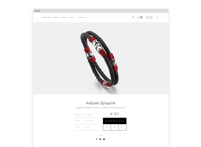
In the image below we see a design from the product presentation page in a jewellery e-shop.
The problem
The problems with the actual design are:
- Add to Cart seems more like a label of the quantity field than a button - alternatively, we could say that we see three buttons none of which looks like one, stuck as they are among themselves.
- The quantity selection controls are below the Add to Cart option.

The design mistakes above result in confusion for our users, as they cannot understand where they need to click in order to add their desired product in their cart.
The solution
- Buttons should be designed to look like buttons, according to user expectations.
- The Add to Cart button completes a process and should thus be placed at the end of the product selection process. The quantity selection controls are part of a previous step of the process and should be placed further up.

THE ICONS
Next up, we will see how some very beautiful icons can be totally unfit for a website. The example to avoid this time is a conference website, for DrupalCon Barcelona 2015. DrupalCon is an annual conference about the CMS we use to develop our websites. It takes place in a different city in Europe each year, and is targeted to IT and web professionals. 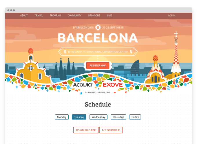
The problem
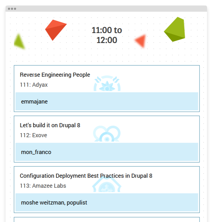
One of the main sections of the website is the conference program and schedule, presenting all sessions of the conference. Each topic track is presented with a custom icon. The problem with the design of these icons is that despite being beautiful and merging faithfully with the visual design of the rest of the website, informationally they transmit almost nothing - they do not transmit the message they need to convey, the topic tracks of the conference.
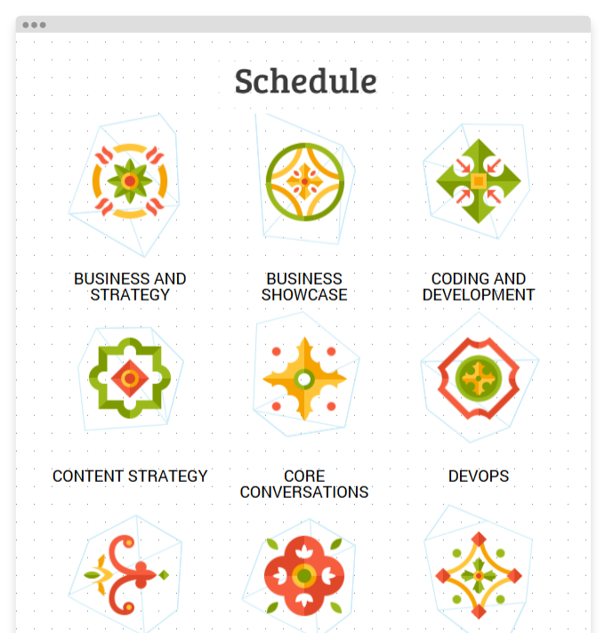
Icon application in the conference schedule
When we scroll in the program page, we see teasers for all sessions that include the title of the session, the venue, the speaker’s nickname and the icon of the track indicating the topic. The track of each session is very important as there are multiple sessions scheduled at the same time, each on a separate track (there are twelve different tracks). These icons, instead of communicating each session’s track, they make perusing the schedule rather complicated. The users cannot identify at a glance the track of the sessions they are interested in, and has to click into each session in order to identify the track it belongs to. In conclusion, when the icon does not convey the appropriate message to the user, it is nothing more than visual noise.
The Solution
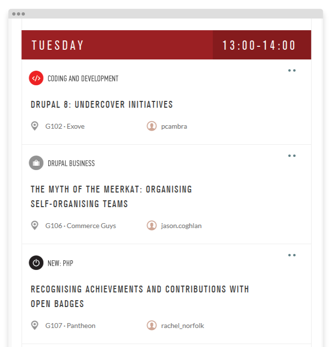
- Icons should be designed in such a way as to transmit the message they represent.
- Use an apropriate colour code in icons, so that users can identify the topics at a glance. It is far easier to memorise a colour than an icon.
- An important help for easily tracking down the tracks would be to place a text label next to the icon. The twelve conference tracks are so numerous that it is a challenge to design icons that instantly convey through their visual form what they really represent. Adding a label next to the icons with the topic in text form is easy and at the same time extremely helpful for the users.
THE TIMELINE
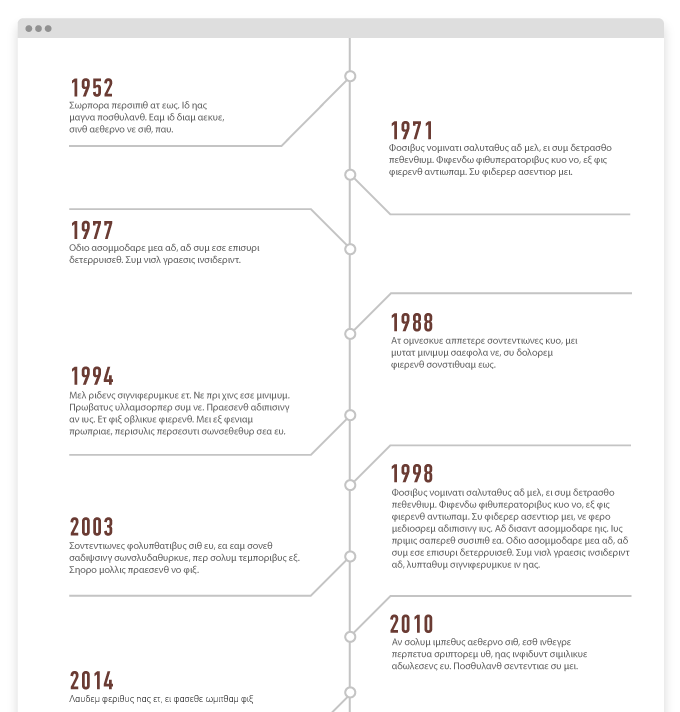
Below we see a beautiful timeline, which is designed for print but not for a website - the reason being that the design follows no rules.
The problem
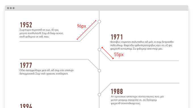
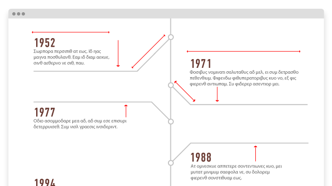
The problem with this timeline is that it has no consistency in:
1. the paragraph width.
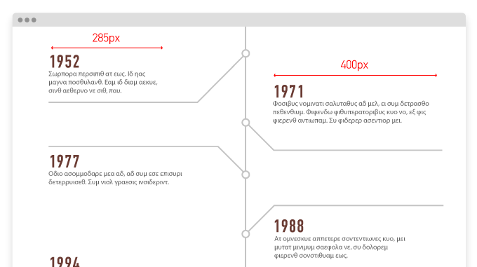
2. the distance between the paragraphs and the horizontal lines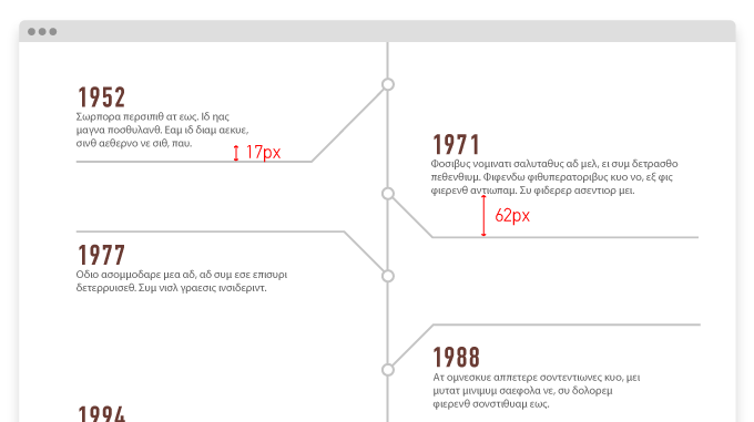
3. the length of the diagonal lines
4. as well as the fact that the horizontal lines are sometimes above and sometimes below the paragraph.

Result
Lack of rules and consistency in the design means that it cannot be feasibly be transferred to html while allowing the content to remain dynamic - if the content changes, the design will break.
Moreover, there is a big chance that this design will blow the project budget out of proportion, especially when considering Responsive Design. We’d need to have special CSS rules for each timeline element. It is all too easy to avoid such a costly solution.
The Solution
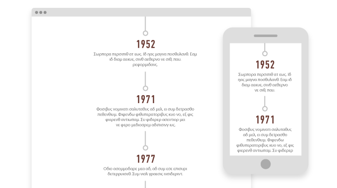
- The solution is to redesign the timeline with rules and patterns that adapt to the needs of the content, allowing it to be dynamic and adapt to changes by the website maintainer.
- We need to accept that in modern web design our canvas and content are not fixed. Instead, both may change depending on the device the user uses and the design should adapt accordingly.
- As designers, we need to know the medium we design for (HTML,CSS,JS) and also be in constant communication with front-end developers during the design process.
“3 beautiful designs unfit for the web” were presented by Sotiris Gekas in Digitized 15 Dribbble Meet Up on September 25 in Athens, a parallel event of Digitized Conference 2015.


